
A slow website affects customer happiness, increases abandonment, lowers brand experience, impacts SEO, and frustrates site admins. We’ve been "under the hood" performance-tuning websites for clients for years. In our Improving Website Performance Series, we'll help you establish a baseline for your site, review the key levers we look to for performance improvements, and point you in the right direction as you get started.
The Curse of Great Bandwidth
Not that long ago in the mid-1990s, bandwidth was measured in kilobytes per second (Kbps). A 1 megabyte per second (Mbps) connection required a T1 line. We had one for corporate traffic at Microsoft (it was an unfathomable bandwidth for a typical user) and the internet zipped along since it was largely free of graphics and most media. The web was built around this Kbps speed since it was meant for text transmission—after all, HTTP stands for HyperText Transfer Protocol.
Fast forward 25 years, and I have a fiber-optic connection to my home office, with 1 Terabyte of data per second in both directions. We have 30+ devices talking to the internet at all times and it serves all devices in our house, including TV, video, gaming, IoT, phones, tablets, and computers. This is faster than most, however, with the average speed being closer to 25 Mbps for most users on a home Wi-Fi network.
The upshot of all that bandwidth is that a website can deliver a much richer experience than the internet’s founders could have possibly imagined. It opened up the opportunity to not just have a simple text-based website, but to deliver a much bigger experience to your customers through the web.
The heyday of user experience (UX) design really aligns with this increase in available bandwidth to deliver the UX.

Design and page weight
When we talk about page weight and its impact on performance, we’re talking about the combined file size of all assets on a page—things like images, video, background graphics, and static files like CSS, Javascript, and HTML code. The more a web page weighs, the slower it loads.
Unfortunately, if the website design features large images, multiple rotating images, and inline videos, it can be very hard to “unwind” without just redesigning and rebuilding the site. As you can imagine, that’s not what anyone wants to hear about their newly-minted, custom-designed website.
The biggest contributor to page weight is the media files.
There may be some cases where the desire for a fully-immersive and robust design experience makes sense for the company’s brand despite the fact that it may “weigh” a bit more.
For example, world-renowned glass artist Dale Chihuly’s website features a very high-end design where the homepage is intended to be an immersive experience with a custom background video montage. It’s a great effect—but it’s not lightweight.
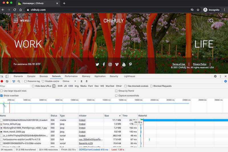
The UX elements on the page are not too large at 3.4Mb in file size, but the background video is 17.7Mb. This is actually pretty tiny for a 25-second decent-resolution video, though you may experience it loading slowly if you are on a slower mobile connection.
In this case, the immersive, rich experience made sense for Chihuly’s brand. Site speed and page performance were very much part of the design/UX discussion to help that full video experience work well.
Check if your website images are optimized
If you use the measurement tools that were outlined in our measuring baseline performance tutorial, one of the items that will likely rise to the top (and is a quick win) is to fix poorly-optimized images.
This is one of the most common errors that happen to the best of us. In fact, we recently ran a Google PageSpeed performance review for our Bear Group website, and one of the things that came back was we had an “enormous” payload.

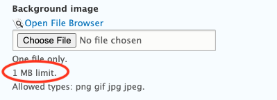
When we looked into it, one of the images on our page had accidentally had its full-resolution (12Mb!) version uploaded instead of the much smaller 100Kb optimized version.
Grabbing the smaller, optimized image at 100Kb was quick and resulted in an instant performance gain on our website.
Pro tip: Set a maximum file size for uploads to pages within your content management system to avoid inadvertently uploading massive files to your website. (We made sure that was in place after our file size mishap!)
Best practices for optimizing website images
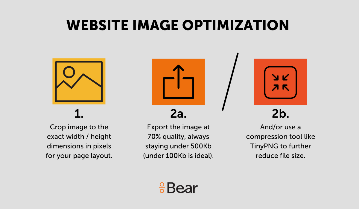
To optimize images on your website, we recommend that you:
- Export images to the exact height/width pixel dimensions needed to match your page layout.
- Make your image file sizes as small as possible as long as it doesn’t compromise the image quality.
Inline images (like an image added inline with a blog post text) will typically load at the exact file size (even if you adjust dimensions) of the file you upload.
Other images, like those uploaded within an image field in a content management system, or a product image in an ecommerce store, will automatically resize, compress, and cache images to a predefined standard.
Either way, it’s important to follow these best practices for image optimization to help with overall page performance.
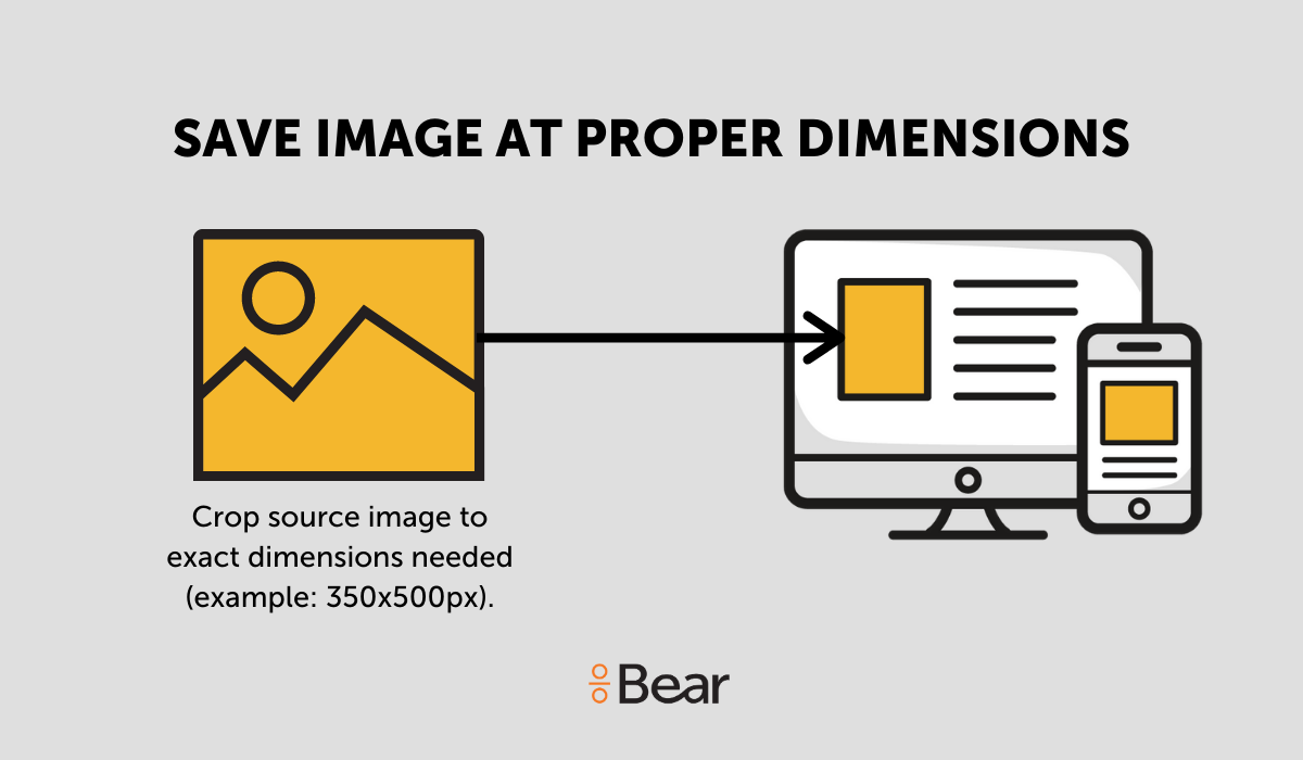
Save images to the exact height/width pixel dimensions for the space
Cropping your images to the exact height and width of the space in your page layout will not only help images appear as they should, it also helps to keep page weight in check.
Your website designer/developer will tell you the ideal image dimensions within page templates, but if you need to find that out for yourself, you can always highlight the section you’re curious about and right-click with your mouse then click “Inspect” to view the dimensions of that highlighted section.
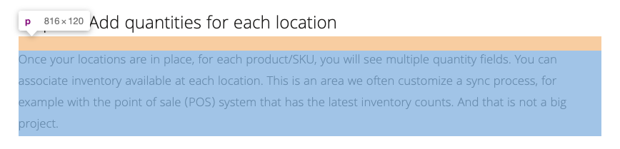
In this example, our blog width is 816 pixels, so we’d want to size our inline blog images at 816px wide (and no less). For inline images like a blog, you have the flexibility to size up images slightly to account for visitors with high-resolution retina display. We size our blog images at 1,200px wide for this reason.
Consider creating a one stop “cheat sheet” of your website’s image dimensions that’s easy for all contributors on your team to reference.
Pro tip: Make it easy for people adding content to your website by listing the image dimensions where they’re easy to find, like we have in this Drupal website.

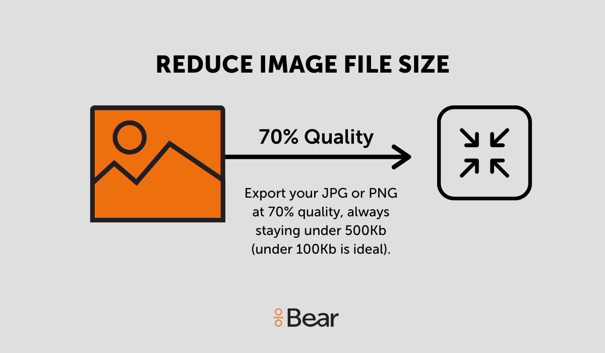
Reduce image file sizes
The most common image file types on a website are JPG for images and PNG for graphics and images that need to be rendered at a higher resolution. You should aim to always keep your image file size under 500Kb (this range is mostly for large, full-width placements) with the majority of your images ideally under 100Kb.
We recommend compressing images prior to uploading them to your site using a free tool like TinyPNG.com.
You can also use next-gen image formats like JPEG 2000, JPEG XR, and WebP—providing better image compression than PNG or JPEG—which will result in faster downloads and less data consumption.
Read more in the series:
- Slow Website? The 6 Most Common Factors that Affect Website Speed
- How to Measure Your Website Speed
- Core Web Vitals and Website Performance Impact on SEO
- How Adding Marketing Technologies Will Affect Website Performance
- How Server and Network Speed Can Affect Website Performance
- What is Website Caching and Why is it Important to Marketers?
- Present Your Website Performance Findings with this Helpful Optimization Report Template